

District Geomapper: A Free Tool to Visualize Voter Demographics
| Timeline: | Apr 12, 2025 | |
| Languages Used: | Python | |
| Software Used: | Pandas, Seaborn, Matplotlib, Geocodio API | |
| Reason: | Academic Presentation Tool |
Picture this: It’s a beautiful Spring day in Colorado, and a good friend (who also happens to be a professor) texts to see if I know anyone who could code up a small project for a good cause. He needs a compelling visual for a presentation to a congressperson, something that screams, “Look how many of our alumni are spread across the country!”
Specifically, he wanted a way to map college alumni addresses to their respective U.S. congressional districts and then generate a neat, presentable graphic. My mission was clear: whip up a quick-and-dirty tool in a few hours. Enter “Geomap Districts” – a Python script born out of a friendly ask, and the magic of geocoding APIs.
The Problem: Making Data Speak to Congress
My professor friend had a list of alumni addresses. What he didn’t have was a way to easily tell Representative So-and-So, “Hey, a significant chunk of your constituents are graduates from our fine institution!” Manually looking up congressional districts for hundreds or thousands of addresses? Not ideal. What he needed was a clear, concise visual (something like a heatmap!) showing the concentration of alumni in different districts.
The Solution: Geomap Districts
I built a lightweight Python script that takes a CSV file full of addresses, sends them off to a geocoding service, pulls back the congressional district information, tallies up the results, and then renders a nice, colorful heatmap. It’s designed to be simple, robust (as robust as a weekend project can be!), and get the job done without a fuss.
How it Works (Under the Hood)
1. The Raw Material: Your CSV of Addresses
The journey begins with a CSV file. My friend had his alumni addresses neatly tucked into a column. The script reads this file, grabs all the addresses, and gets them ready for their geographical adventure.
2. The Magic Translator: Geocodio API
For the heavy lifting of turning an address into precise latitude/longitude coordinates and, more importantly, attaching it to a congressional district, I leaned on the Geocodio API. Think of it as a super-smart digital cartographer.
I set up a GeocodioClient (powered by a secure API key from an environment variable, of course – always protect your keys!) and sent batches of addresses its way. The API returns a wealth of information, including that precious congressional_districts field.
Side note: Working with external APIs is often like dealing with a black box. You send a request, and you hope to get clean data back. This project was a good reminder to always, always build in robust error handling, from invalid API keys to server hiccups or even just weirdly formatted responses.
3. Sifting Through the Gold: Extracting Districts
This was where some of the weekend’s “fun” happened. Geocodio is great, but real-world data (and API responses) can be messy. The extract_districts function became my personal data detective:
- Handling the “No-Go"s: What if Geocodio couldn’t find an address? Or if the response was malformed? The function had to gracefully skip these.
- The “At-Large” Enigma: Some states have just one congressional district, often referred to as “at-large.” Geocodio might label these as district “0” or “98.” My function cleverly standardizes these to “AL” (e.g.,
DE-AL) for consistent visualization. Because who wants district 98 on their beautiful heatmap? - Parsing Quirks: Different responses might have slightly different structures or missing pieces. I built in checks to make sure I wasn’t trying to access data that simply wasn’t there, preventing those dreaded
KeyErrororAttributeErrormessages.
Here’s the core logic for extracting and standardizing district information:
 1def extract_districts(geocodio_response):
 2    """Extracts state-district codes from Geocodio batch response."""
 3    districts = []
 4    for result in geocodio_response.get('results', []):
 5        if result and 'congressional_districts' in result:
 6            cd_data = result['congressional_districts']
 7            if cd_data and isinstance(cd_data, list) and len(cd_data) > 0:
 8                # Assuming the first district in the list is the primary one
 9                district_info = cd_data[0]
10                state_abbr = district_info.get('state_legislative_district_lower', {}).get('state') # More reliable state
11                district_number = district_info.get('district_number')
12
13                if state_abbr and district_number is not None:
14                    # Handle "at-large" districts (often district 0 or 98/99)
15                    if district_number == 0 or district_number >= 98:
16                        districts.append(f"{state_abbr}-AL") # Standardize to At-Large
17                    else:
18                        districts.append(f"{state_abbr}-{district_number:02d}") # Format as XX-01, XX-10
19                else:
20                    # Fallback for states with no specific district, or parsing issues
21                    if state_abbr:
22                        districts.append(f"{state_abbr}-Unknown")
23                    else:
24                        districts.append("Unknown-Unknown")
25            else:
26                districts.append("No District Info")
27        else:
28            districts.append("No Geocode Result")
29    return districts
4. Counting Up the Constituents: Pandas Power
Once I had a clean list of STATE-DISTRICT IDs (like CA-16 or NY-12), Pandas made quick work of counting them up. A simple value_counts() on a Pandas Series gave me the exact frequencies of alumni in each district. Data analysis, simplified!
 1def analyze_districts(district_list):
 2    """Counts the occurrences of each district and prepares data for plotting."""
 3    if not district_list:
 4        print("No districts to analyze.")
 5        return pd.DataFrame(), pd.DataFrame()
 6
 7    district_counts = pd.Series(district_list).value_counts().reset_index()
 8    district_counts.columns = ['District', 'Count']
 9
10    # Separate state and district for better plotting
11    district_counts[['State', 'DistrictNum']] = district_counts['District'].str.split('-', expand=True)
12
13    # Convert DistrictNum to numeric for sorting, handling 'AL' for At-Large
14    district_counts['DistrictSort'] = pd.to_numeric(
15        district_counts['DistrictNum'].replace({'AL': 9999, 'Unknown': -1}),
16        errors='coerce' # In case of other unexpected values
17    )
18
19    # Sort for better visualization: by State, then by DistrictNum
20    district_counts = district_counts.sort_values(by=['State', 'DistrictSort']).reset_index(drop=True)
21
22    # Create pivot table for heatmap
23    pivot_table = district_counts.pivot_table(index='State', columns='DistrictNum', values='Count').fillna(0)
24
25    # Re-sort columns (districts) numerically for the heatmap
26    sorted_columns = sorted([col for col in pivot_table.columns if col.isdigit()], key=int)
27    if 'AL' in pivot_table.columns:
28        sorted_columns.append('AL')
29    if 'Unknown' in pivot_table.columns: # Handle 'Unknown' district numbers
30        sorted_columns.append('Unknown')
31    if 'No District Info' in pivot_table.columns:
32        sorted_columns.append('No District Info')
33
34    pivot_table = pivot_table[sorted_columns].copy()
35
36    return district_counts, pivot_table
5. Bringing it to Life: The Heatmap
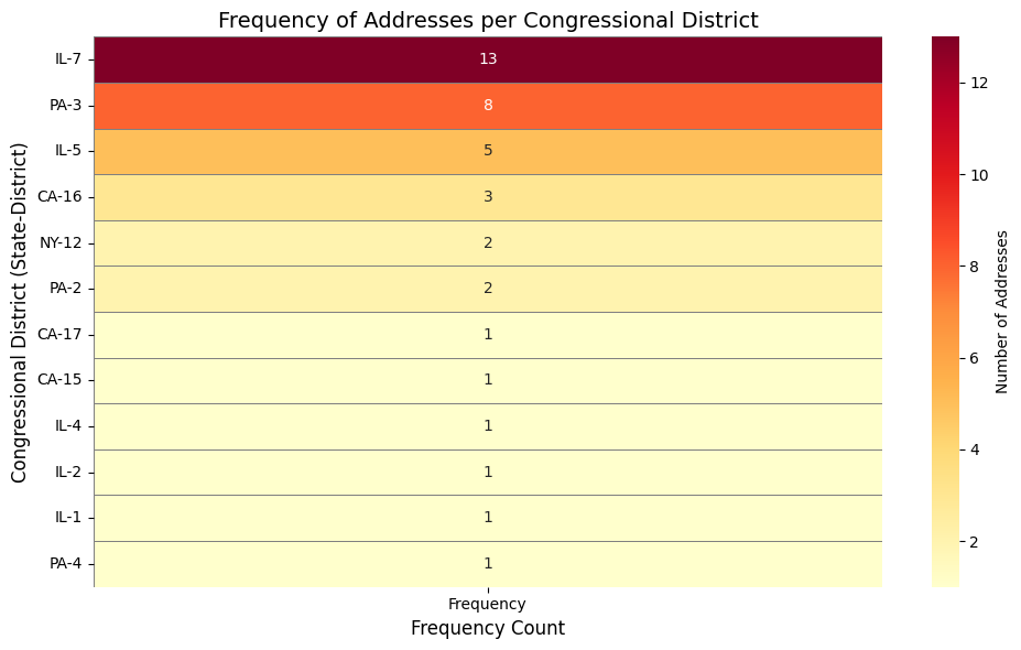
Then came the grand finale: a visual representation. Using Seaborn and Matplotlib, I generated a heatmap. This isn’t just a pretty picture; it’s a powerful way to immediately see which districts have the most alumni.

Example output showing addresses mapped to 12 districts
- The heatmap dynamically adjusts its height based on the number of districts (no more squished labels!).
- It uses a “Yellow-Orange-Red” color scheme (
YlOrRd) – because nothing says “important data” like a gradient from sunshine to fiery passion. - Each cell is annotated with the exact number of addresses, so there’s no guesswork.
Watching that heatmap pop up, clearly showing the concentrations of alumni, was pretty satisfying. Mission accomplished for the professor!
Reflections & Takeaways
- APIs are Gold (and sometimes lead to gray hairs): While APIs abstract away complexity, understanding their quirks and building robust error handling is crucial for real-world applications.
- A Weekend Project’s Superpower: Sometimes, the most valuable tools aren’t grand, sprawling applications, but small, focused scripts that solve a very specific, immediate problem.
- Data Storytelling: Translating raw data (a list of addresses) into a clear, visual story (a heatmap of district concentrations) is pretty powerful, especially when you’re trying to make a point to, say, a congressperson.
If you’ve got a list of addresses and want to see their congressional districts come to life, grab a free API key and try it yourself! And remember, every successful project usually has a few “why is this not working?!” moments behind it.